Shell · 2023
Streamlining hierarchical data representation
I led the design of Ted from 0-1: researching and identifying problems, then designing and handing off for implementation — filtering, searching and an abstract data structure that works across all data types.
- Role
- Product design lead
- Duration
- 2 months
- Client
- Shell
Context
Ted is a platform designed to ingest data from diverse third-party sources, catering to product owners, data architects and desk analysts. Its objective is to consolidate data across multiple pipelines, establishing a definitive system of truth accessible to all stakeholders — harmonising disparate data streams so users get comprehensive, reliable insights.
Problem
The system presented a significant challenge for users navigating hierarchical data. Users would explore groups of data only to find no providers were visible, because providers were consolidated at the lowest hierarchy level.
This stemmed from a lack of clarity in data representation, making it hard to comprehend relationships and attributes within the system, which affected decision-making and insight discovery.
The existing hierarchy also lacked consistency in column attributes across levels, leading to confusion — users found it difficult to differentiate between geopolitical entities and materials due to inadequate column alignment.
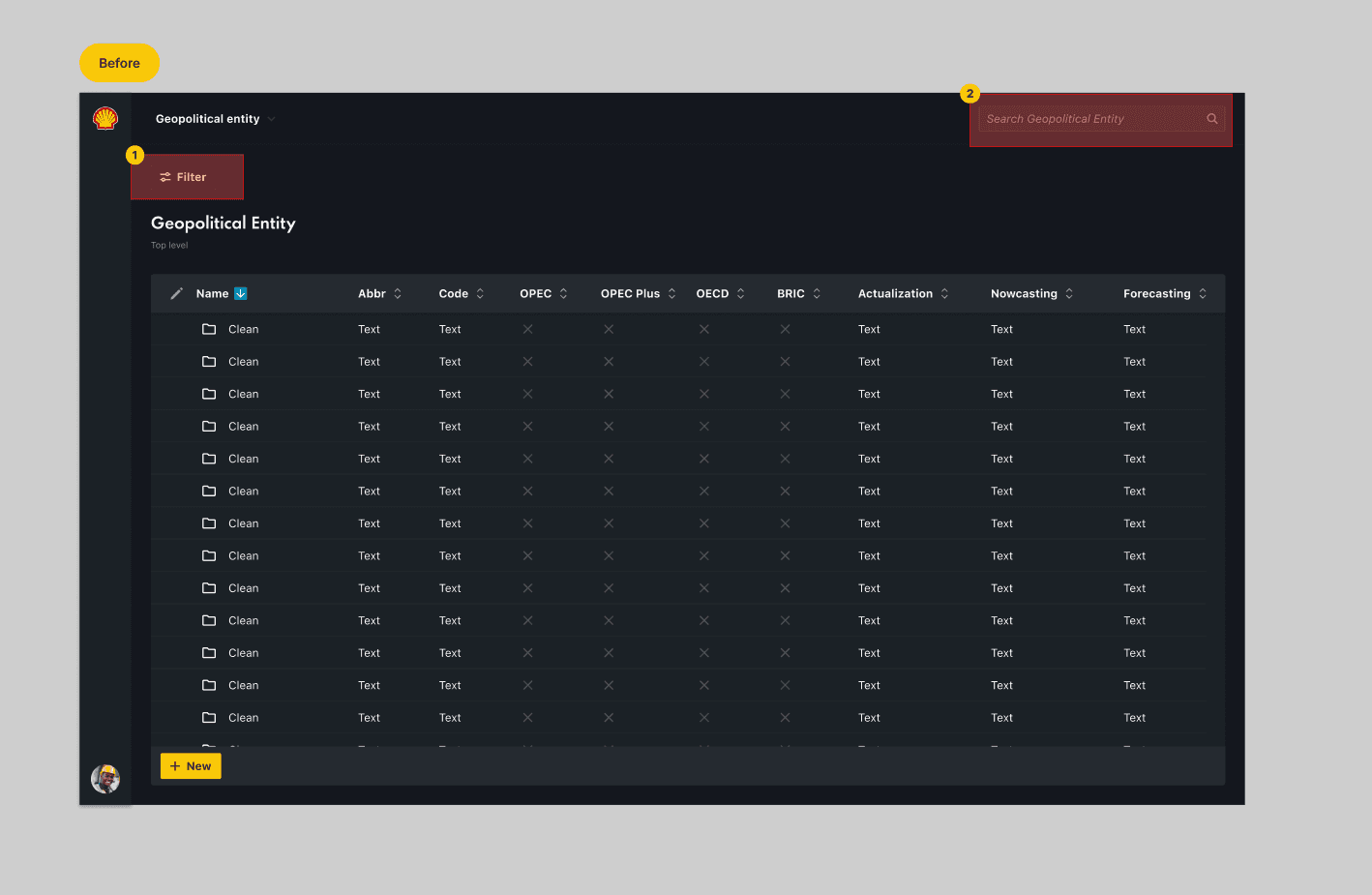
Key issues
- No filters
- There was no clear way to navigate large data volumes, so users had to click through many layers to find information.
- Limited search
- Search was limited to geopolitical entities, so searching for material entities reached a dead end.
Goal
Increase product adoption by tackling the main pain points.
Success metrics
- User adoption rate
- The percentage of users who actively engage with the platform after launch. Higher adoption indicates successful onboarding and acceptance.
- Reduced support requests
- A decrease in requests related to data access, navigation or functionality indicates improved usability and self-service.
- Data accuracy and consistency
- Accuracy, completeness and consistency across different sources and reports.
- Time saved in data retrieval
- Reduced time spent retrieving data indicates increased efficiency and productivity.
Solution
Ted was redesigned to make information retrieval far easier by introducing a variety of ways to help users find information — from improved filtering and search to a system that streamlines hierarchical data and better mapping of data types.
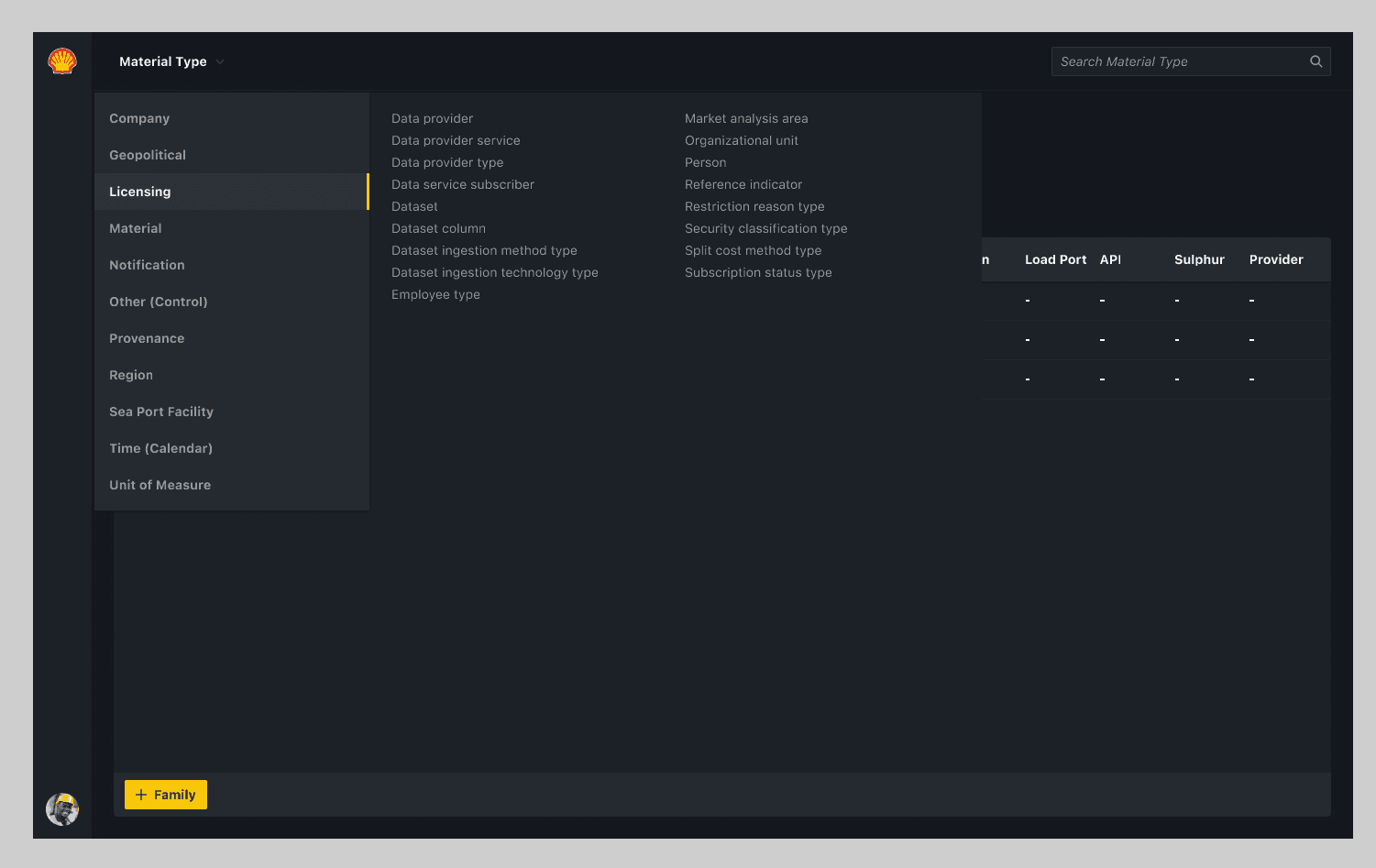
Design decision 1: Navigation
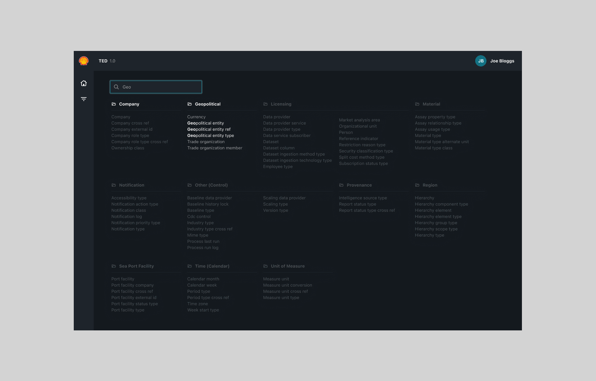
New and improved navigation that groups items based on their relatedness. The next release introduced navigation search to simplify it further.
Design decision 2: Home
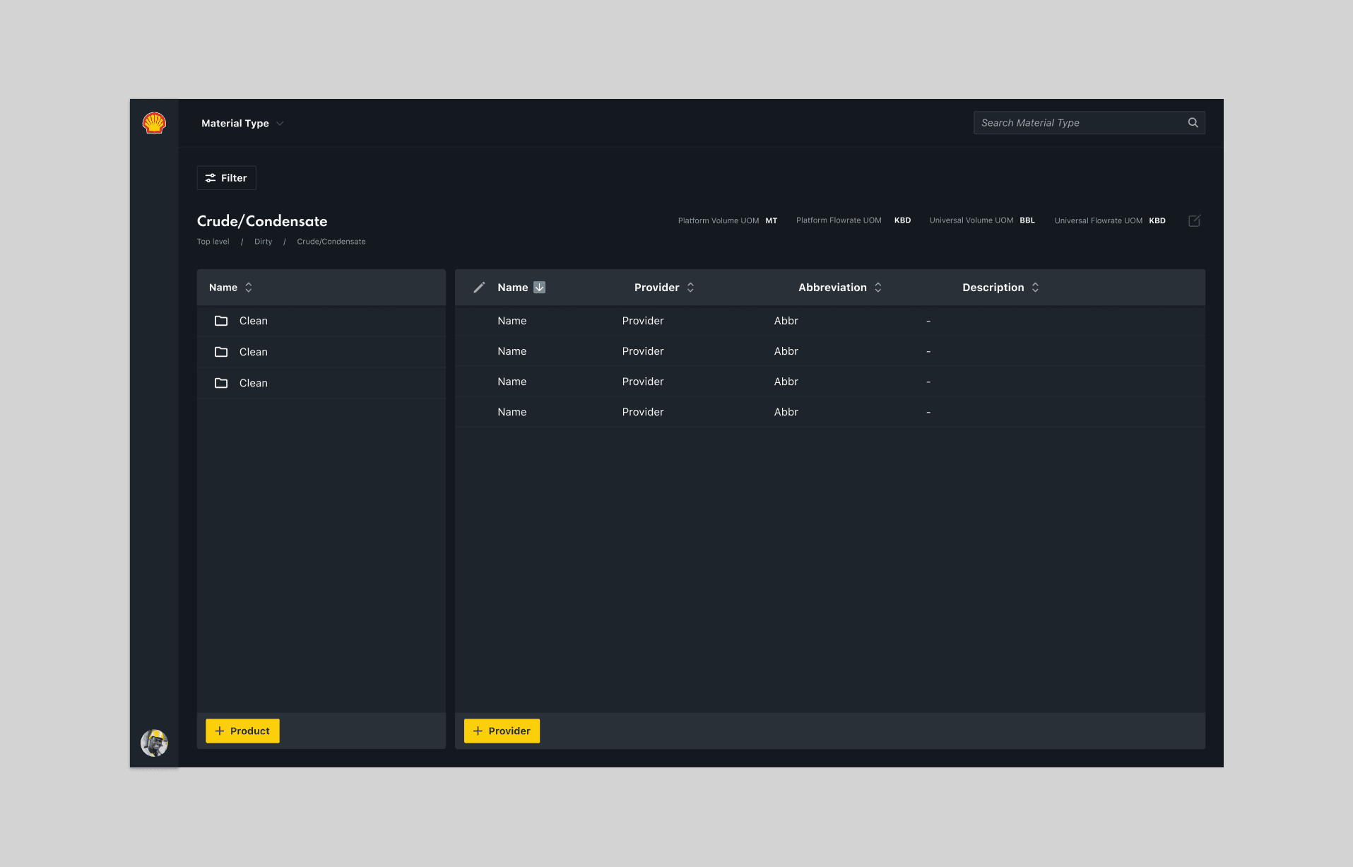
To prioritise the features that would create the most value in the shortest time, I worked with product, research, engineering and product ops to strategise an MVP release, focusing on the two workflows that dominate most of the day-to-day work.
Design decision 3: Display hierarchy
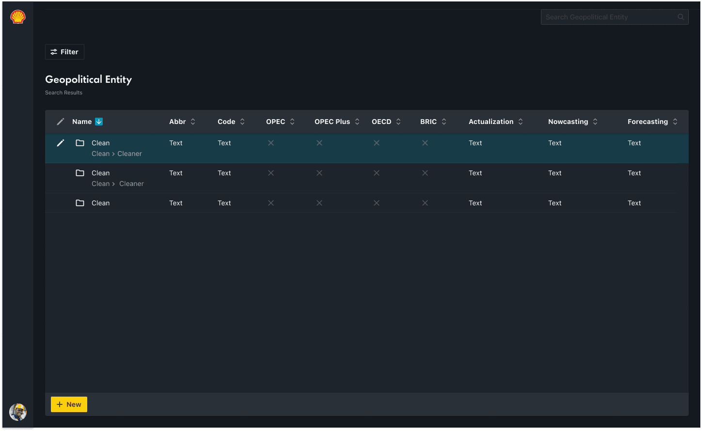
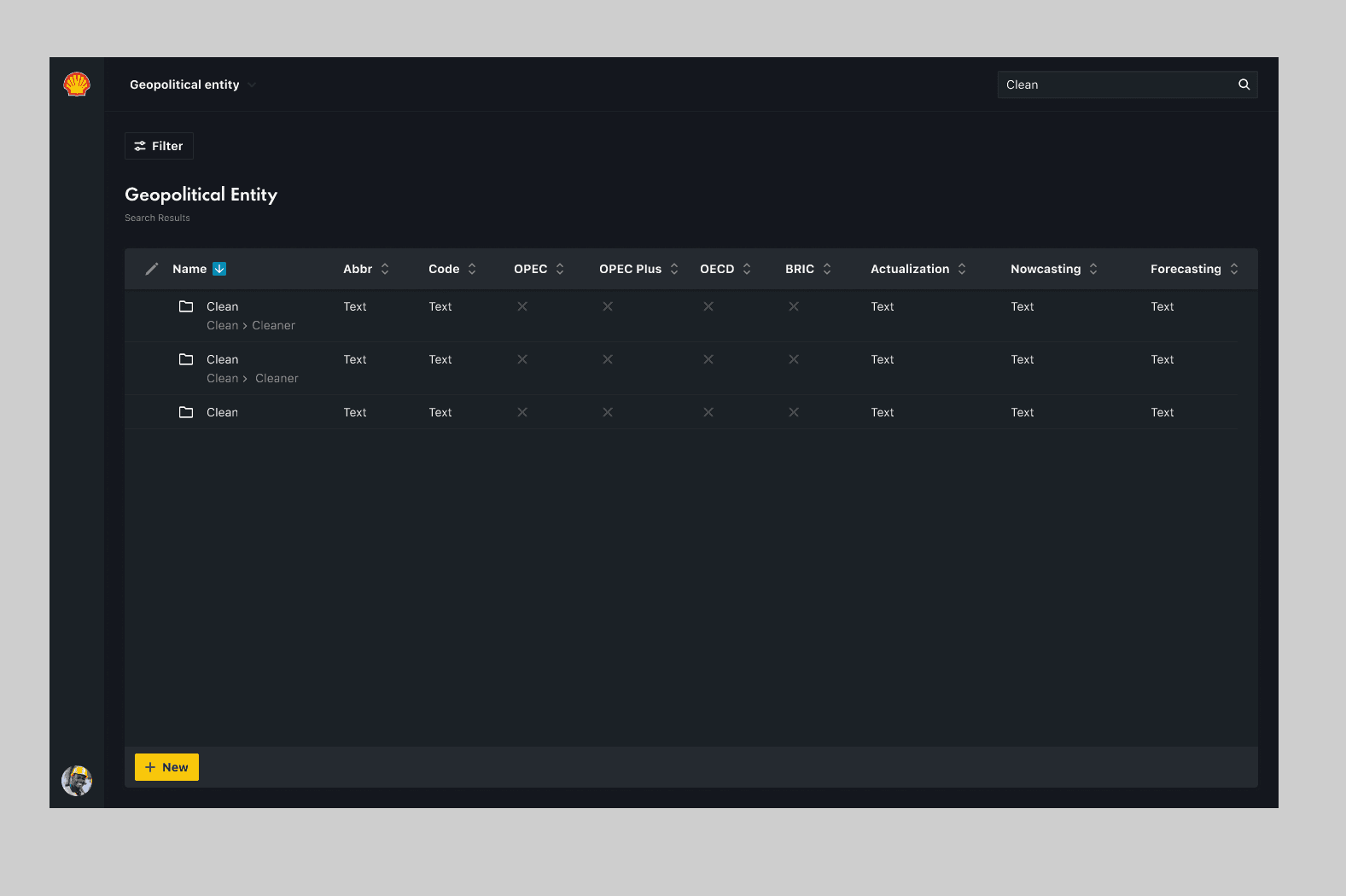
Displaying the parent-child relationship so users are aware of a record's origins. Many similar names come from third-party vendors, so this gives users confidence and speeds up decision-making.
Outcomes
- Increased user adoption
- 20% increase in weekly active users.
- Fewer support tickets
- Support tickets decreased 24% within the first month.
- Task completion
- Task completion rate reached an all-time high.
Takeaways
Finding information in a large corporation is like finding a needle in a haystack. A considerable amount of time is dedicated simply to locating information.